Branding / Marketing / Design / Collaboration
A stylish cafe that offers coffee alongside a decent range of salads, light bites, pastries and desserts —
OOO Coffee
for


OOO Coffee brand identity
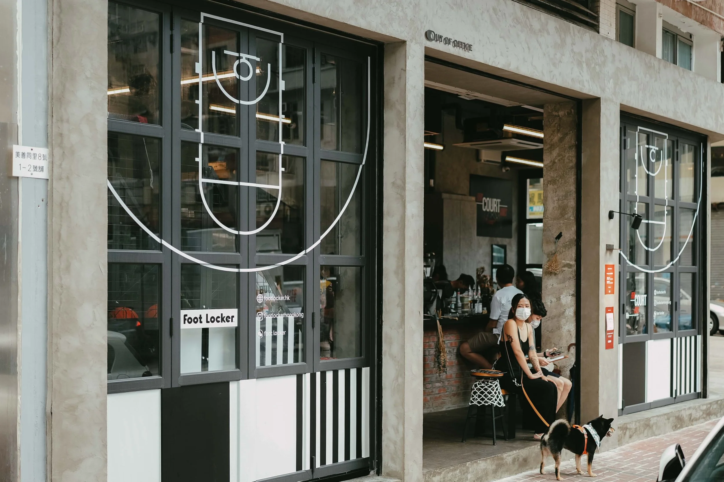
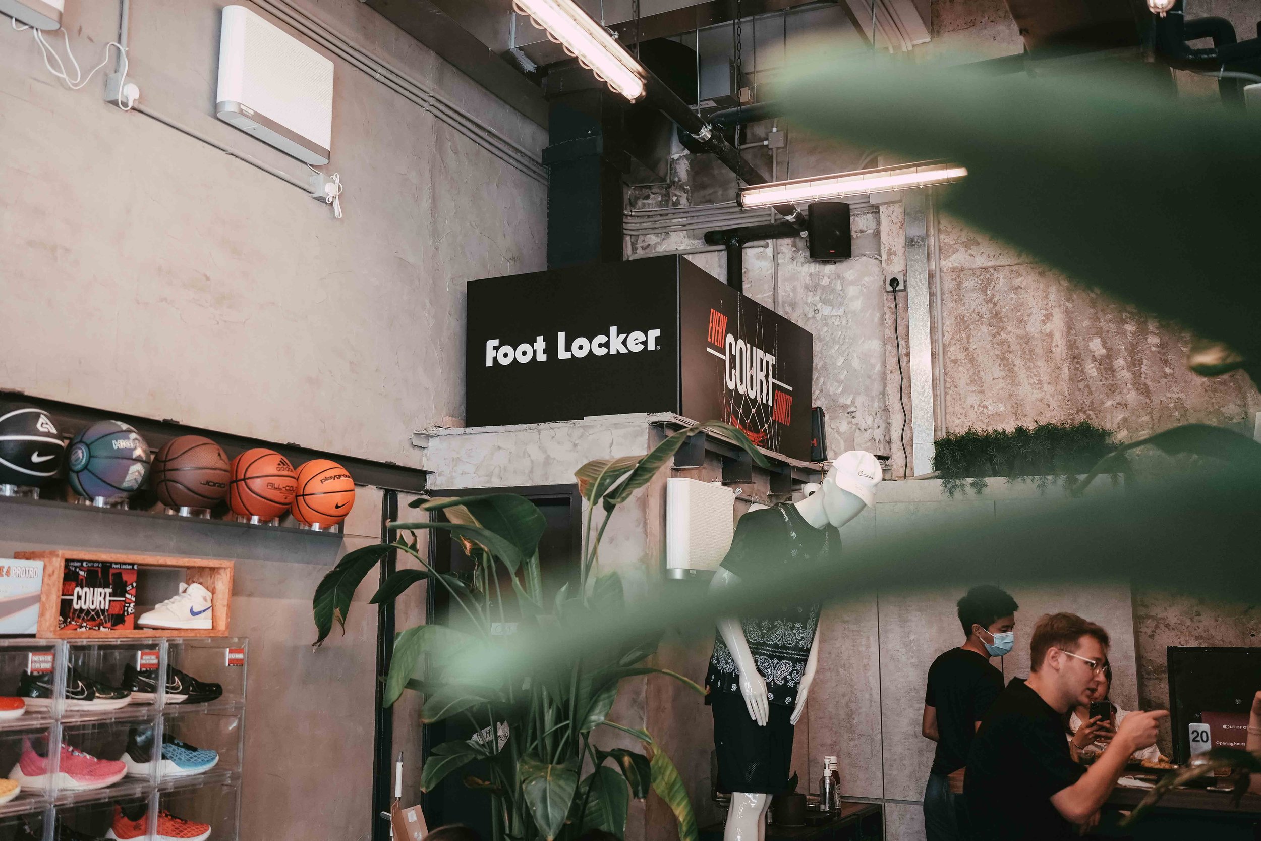
OOO Coffee was going to be launched in To Kwa Wan, Kowloon City District of Kowloon. The team knew the location was remote and difficult to attract customers. Coffee culture was not common in the area. Strong competitiveness among coffee shops that were established years in Kowloon. Clear and actionable branding and marketing strategy were needed.
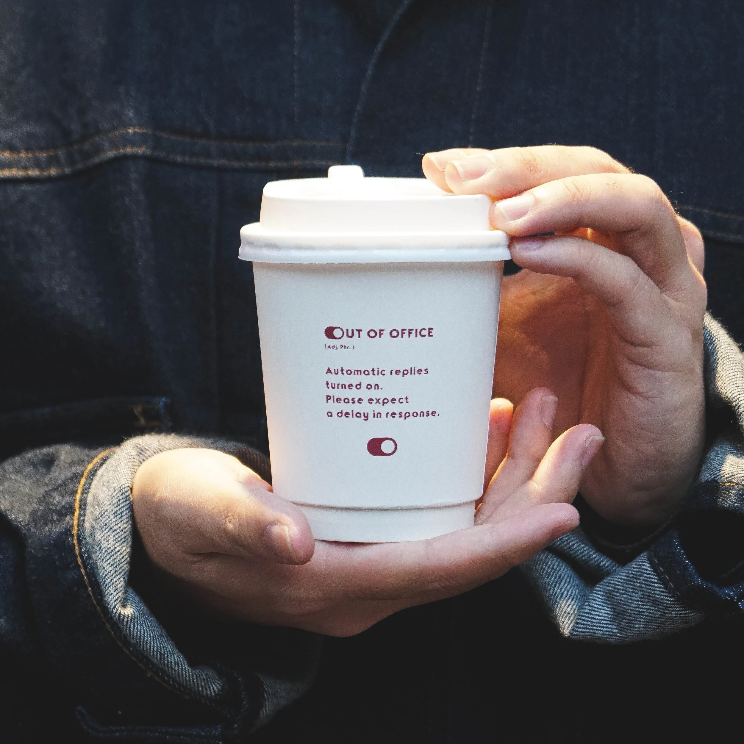
First we needed to clarify who it is, what it stands for, and what it’s ultimately offering customers. Mentally the team already suggested ‘Out Of Office’ to draw customers in Hong Kong , so some exercises helped get it out on paper. Then we translated the insights into a visual identity they could run with.
LOGO DESIGN
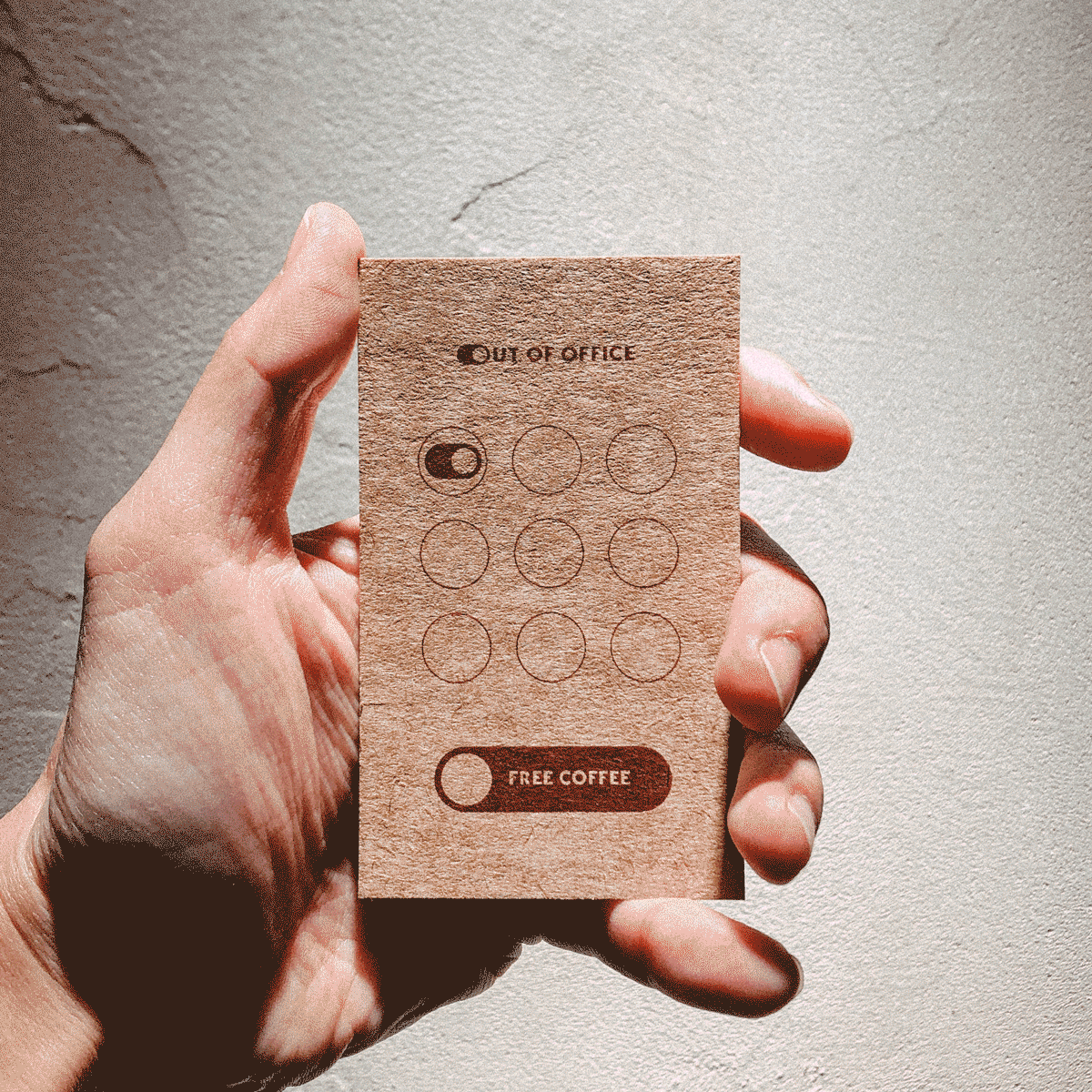
The logo embodies the on/off button which correlates to the name “Out of Office”. As we get off from work, we switch off our working mode.
TYPEPOGRAPHY
TYPOGRAPHICA // REGULAR


TAKEAWAY PRINT
NEIGHBORHOOD POSTER

LOGOTYPE
The logotype is simple with letterforms that take on more of a direct message to customers.
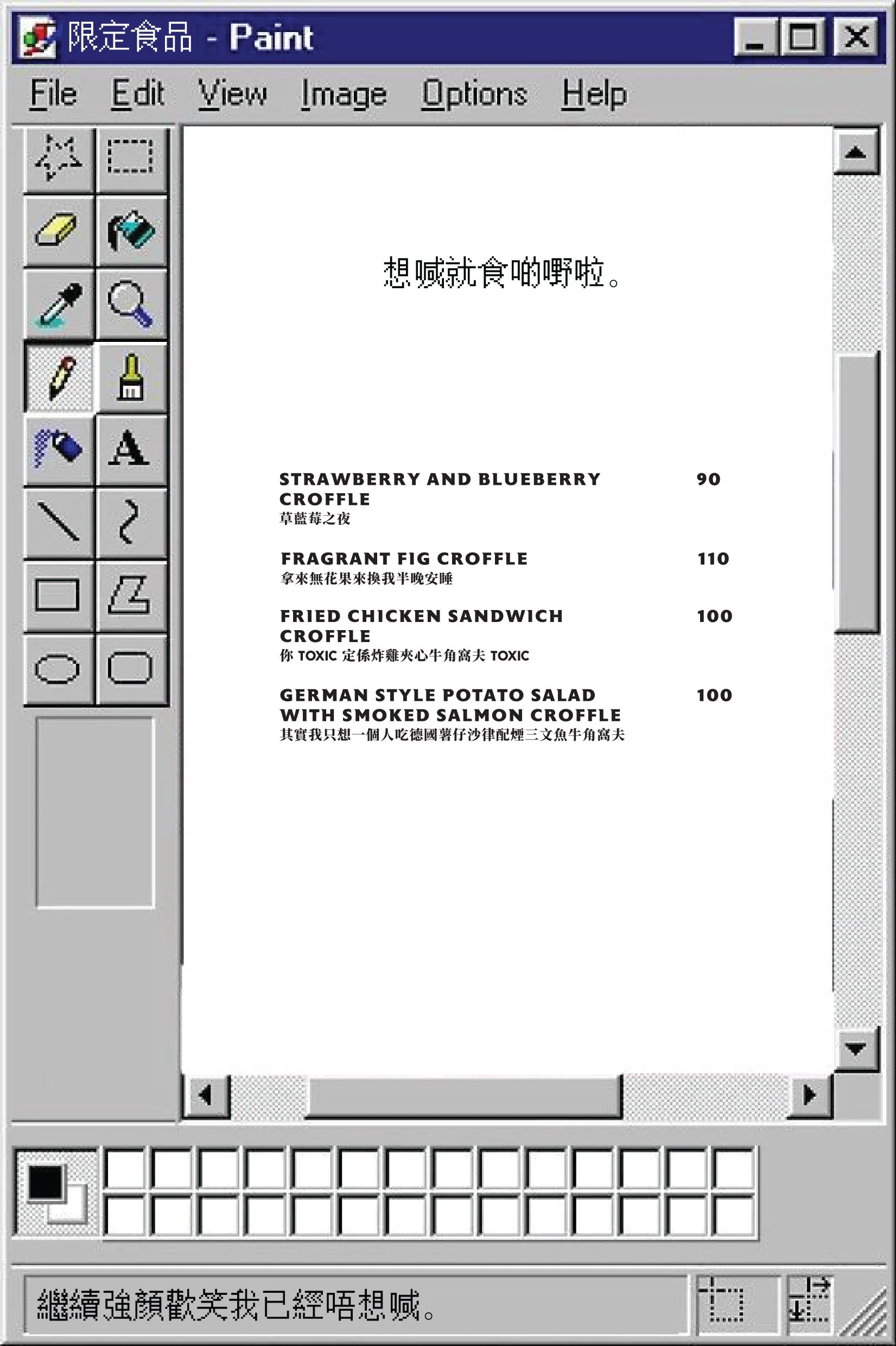
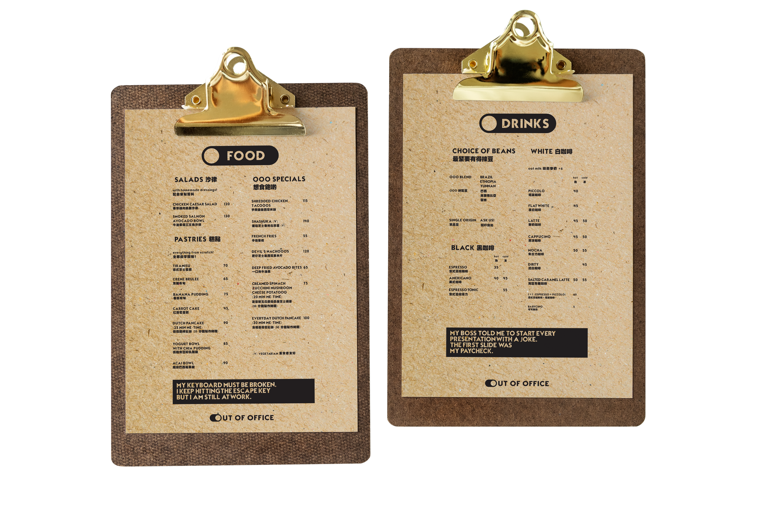
MENU DESIGN
LOYALTY CARD


COLLAB MENU